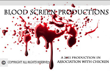
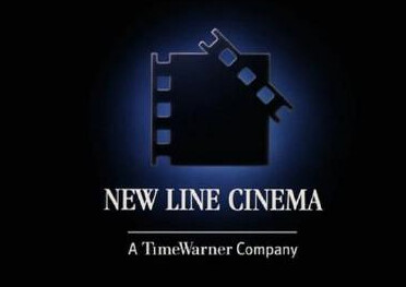
This is our production logo, we feel it relates to a thriller as the image is of blood. we wanted something quite simple but very effective. We came up with the name after we had seen others for inspiration and gained ideas from viewing others. Examples we looked at are 'New Line Cinema' which is a still image which is quite simple as well. The logo we used and looked at for help were all still images, a lot of production logos now include a short clip which contains movement. To keep things simple and down to basics we opted for the still image as it works well with our piece.
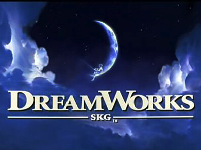
The most famous production image is 'Dreamworks'. The logo of dream works only used two different colours and has thriller conventions about it, for example the darkness. Although this is a still image of dream works, they now have a moving image and the logo changes depending on what type of film they are producing. We tried to combine the best features of both of these images to create ours.
No comments:
Post a Comment